ICAA - CPE Training page
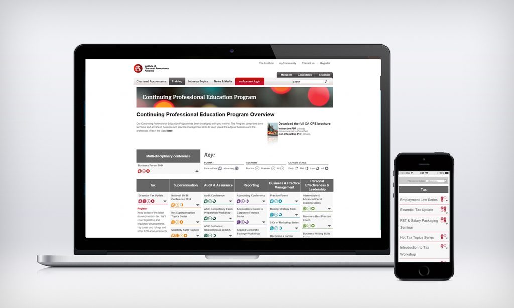
Client
Institute of Chartered Accountants Australia
My role
UX / UI designer
Deliverables
Research, IA, wireframes, UI design, component specs
Platform
Member website, training catalogue
Overview
Chartered accountants must complete a set number of Continuing Professional Education hours every three years. The Institute runs hundreds of courses, webinars, conferences and on-demand modules to help members meet that requirement, but the training pages made it hard to work out what counted, what was coming up and what was worth the money.
I redesigned the CPE training landing page and the catalogue experience behind it, as part of the wider ICAA website redesign.
The challenge
- Courses were listed by internal product code and delivery team, not by topic or member need.
- Members could not see how many CPE hours each option gave them, which was the first question they asked.
- Face-to-face, live online and on-demand formats were on separate pages with separate booking flows.
- The page looked like a brochure, but members used it like a shop.
Research
Member interviews
Talked with members in practice, industry and public sector about how they plan and track their CPE.
Analytics and search
Found that most visits started from a search for a topic or a date, not from the training homepage.
Competitor review
Benchmarked professional bodies and online learning platforms for catalogue and booking patterns.
Card sort
Members sorted 80 courses into the topic groups that made sense to them, replacing the internal taxonomy.
Design
Before
- Long editorial page with courses buried below promotional banners
- No CPE hours, price or format shown until the detail page
- Separate pages per delivery format
- Booking through a different-looking legacy system
After
- Search and filter panel at the top: topic, format, date, hours, price
- Course cards showing hours, format, date and price at a glance
- One catalogue for every format, with format as a filter
- "My CPE" summary showing hours completed and hours still needed
Visual design
The page adopted the new ICAA design system but pushed the components towards a cleaner, more utilitarian style. Course cards use a strong hierarchy (hours first, then title, then logistics), a restrained palette with one accent for calls to action, and clear format icons so members can scan a long list quickly on a phone between meetings.
Outcome
The redesigned CPE pages launched ahead of the triennium deadline, when demand is highest. Bookings rose while support calls about "what counts" fell, and the course card became a standard component reused across the member site.