Northern Beaches Council - Redesign
Client
Northern Beaches Council
My role
Lead UX / UI designer
Deliverables
Research, IA, wireframes, visual design system
Platform
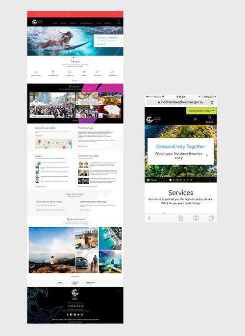
Responsive public website
Overview
When Manly, Warringah and Pittwater councils amalgamated into Northern Beaches Council, residents were left with a patchwork: three old websites, three sets of forms and three different ways to pay rates or report a pothole. The new council needed one website that felt like one organisation, and that worked for a community that mostly reaches council from a phone.
I led the UX and visual design for the redesign, from early research through to a component library that the council's web team could keep building on.
The challenge
- More than 12,000 pages of legacy content, much of it duplicated across the three former councils.
- Navigation mirrored council departments, so residents had to know who owned a service before they could find it.
- Key tasks such as paying rates, booking a bulky goods collection and lodging a DA lived in separate systems with different looks.
- A new brand had just been created, but there was no digital design language to go with it.
Research
Analytics & content audit
Identified the 50 tasks that made up the large majority of visits, and flagged content that could be retired or merged.
Resident interviews
Talked with residents, ratepayers, local businesses and community groups at libraries and customer service centres.
Contact centre shadowing
Listened in on calls to hear the questions the website was failing to answer.
Card sort & tree test
Tested a task-based structure with more than 200 residents before committing to it.
Key insight
People do not think in departments. They think "bins", "rates", "parking", "the beach". The new information architecture was built entirely around those everyday words, with a strong search and a "popular services" block on the homepage for the tasks that never change.
Design
Before
- Department-based menus, up to 5 levels deep
- Desktop layouts squeezed onto mobile
- Inconsistent buttons, forms and colours across systems
- Council news dominating the homepage
After
- Task-based IA with 8 top-level topics
- Mobile-first, responsive templates
- One design system shared across web and online services
- Homepage led by search and popular services
Templates and components
I designed a small set of flexible page templates (topic landing, service page, step-by-step guide, location and event pages) rather than dozens of bespoke layouts. Each was built from a shared component library so content editors could assemble pages without breaking the design.
Visual design
The visual language took the council's new brand and made it work on screen: an accessible colour palette derived from the coastline, generous white space, clear typography and a consistent icon set. Every colour pairing was checked against WCAG 2.1 AA contrast requirements.
Outcome
The redesigned site launched as the single front door for the new council. The design system went on to underpin the integrated search and the staff intranet homepage, so residents and staff now share one consistent experience.