USI - Research + design
Client
USI Registry, Australian Government
My role
UX researcher / designer
Deliverables
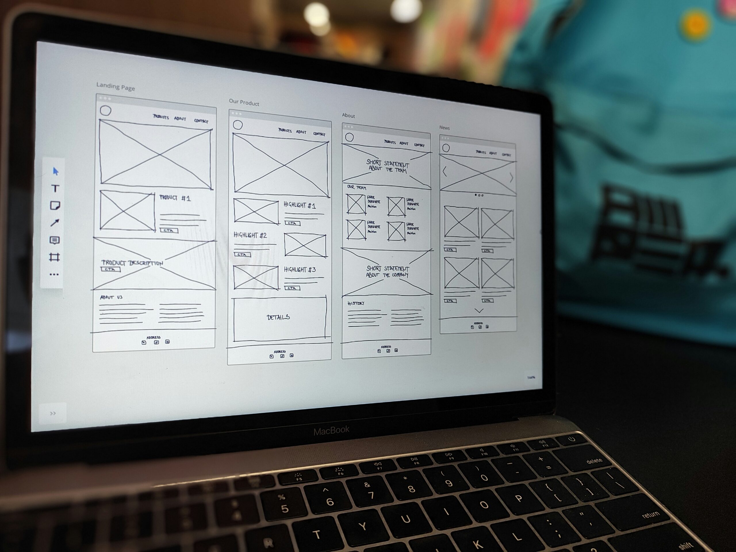
Research, personas, IA, wireframes, UI design, pattern library
Platform
Student portal, provider portal, public website
Overview
Every student in Australian vocational education and higher education needs a Unique Student Identifier. The registry serves millions of students, tens of thousands of training providers and every university, through three separate portals that had grown apart over a decade.
I ran the research program and led design for a unified experience across the student portal, the provider portal and the public website.
The challenge
- Students often created duplicate USIs because they could not find or remember their existing one.
- Identity verification failed for people with name changes, overseas documents or limited ID.
- Provider staff performed the same tasks hundreds of times a day using screens built for occasional use.
- Three portals, three visual styles, three sets of terminology.
Research
Contact centre analysis
Categorised a year of enquiries to find the top reasons students and providers needed help.
Student interviews
Domestic, international, mature-age and school-based apprenticeship students, in person and remote.
Provider observation
Sat with enrolment officers at TAFEs, private RTOs and universities during peak enrolment.
Usability benchmarking
Measured task success on the existing portals to have a baseline to improve against.
Design
Before
- "Create" and "Find" your USI given equal weight, driving duplicates
- Identity documents chosen from a long, jargon-heavy list
- Provider bulk tasks buried behind single-record screens
- Three inconsistent interfaces
After
- "Find your USI first" flow that checks for an existing identifier before creating one
- Guided document selection based on what the student has to hand
- Provider dashboard with bulk verify, bulk create and clear status
- One pattern library across all three products
Pattern library
I built the design on the Australian Government Design System and extended it with the registry-specific patterns that came up again and again: identifier display, document verification status, and provider permissions. The library was handed over in Figma with usage notes so the in-house team could keep it current.
Outcome
The redesigned student portal launched ahead of the peak enrolment period. Providers reported faster onboarding of new enrolment staff, and the "find first" flow measurably cut duplicate records, which had been the registry's most costly support issue.